

 Christmas


×


How to Light Printed Photography Backdrops for a Realistic Look
Match your key-light direction, height, shadow softness, and backdrop exposure to the light printed in scenic photography backdrops.
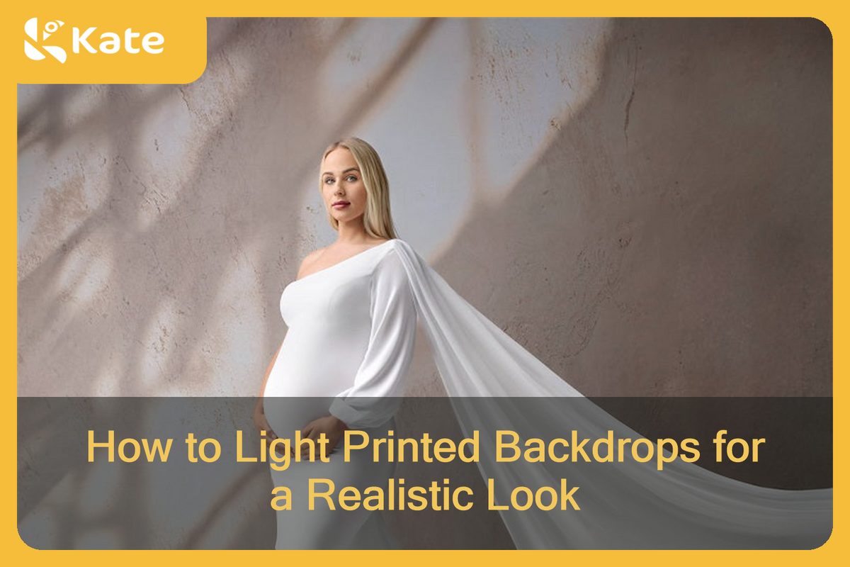
Printed photography backdrops often contain their own light cues: a bright window on one side, a soft glow across a wall, or a darker corner that suggests where the light falls away. When your real key light supports those cues, the subject feels like part of the scene. When it contradicts them, even a well-exposed portrait can look assembled.
This guide focuses on that match. It is written for portraits made with printed scenic fabric backdrops, rather than solid-color backgrounds or general studio lighting. If you need the basics of subject-to-background distance, separate background exposure, or reducing unwanted shadows, start with our broader guide on how to light a photography backdrop.
Read the Light Already Printed in the Scene
Before placing a light, look at the backdrop by itself. Find the brightest area, then ask what could have created it. A printed window may suggest light from camera-left. A bright patch high on a wall may suggest a raised source. A dark painterly design may not show a literal window, but it can still have a visible highlight-to-shadow direction.
Use three questions:
- Which side of the scene appears brightest?
- Does the light look hard and defined, or broad and soft?
- Where would a person naturally stand without covering the visual source of that light?
Do not treat printed windows, doors, furniture, flowers, or sunbeams as physical set pieces. They are part of the printed image. Your real light cannot come through a printed window, but it can arrive from the same apparent direction and create a believable continuation of the scene.

Place the Subject Where the Printed Light Makes Sense
Subject placement is part of the lighting decision. Start with the main scene elements, then leave enough visible backdrop to explain the setting. If a printed window is the obvious light source, avoid placing the subject directly over it unless the crop still makes the direction clear.
Next, look at the subject’s face and body angle. Turn the subject slightly toward the apparent source so the key light can shape the face naturally. If the design has a brighter side and a darker side, placing the subject near that transition often feels more convincing than centering them without reference to the scene.
There is no single correct subject distance for every printed backdrop. Use enough separation to frame the design cleanly, control shadows, and keep the subject from visually merging with detailed areas. Larger groups and wider compositions may need more backdrop width and more working distance than a headshot or seated portrait.
Match the Key Light’s Direction and Height
Direction is the first match to make. If the printed light appears to come from camera-left, place the real key on that side. If the brightest cue is high, raise the key enough that the shadows on the face and clothing also travel downward. The goal is not to copy the print with mathematical precision; it is to avoid obvious contradictions.
Use the eyes, nose shadow, and jawline as quick checks. A portrait can feel wrong when the printed wall is bright on the left but the subject’s nose shadow shows a strong light from the right. Move the key before adding more fill or adjusting the backdrop.

Match Shadow Softness, Not Just Direction
A light can come from the correct side and still feel out of place. Compare the edges of the printed shadows with the shadows on the subject.
If the backdrop suggests a large window or a soft painted glow, use a broader source or bring diffusion closer to the subject. If the design contains a crisp sun patch, a more defined source may fit, but keep the transition believable on skin and clothing. You do not need to recreate every printed shadow. Match the overall character of the light.
Fill light should support that character rather than erase it. Add only enough fill to keep important facial detail. Too much frontal fill can flatten the subject while the backdrop still shows a clear side-to-side transition.

Control Spill on the Backdrop
Light that reaches the backdrop changes the contrast and color you see in the final frame. Too much spill can wash out a dark design or weaken a printed beam of light. Too little can hide useful tonal detail.
Expose the subject first. Then review the backdrop separately. Feather the key across the subject rather than pointing its brightest center directly at the fabric. If the background still needs adjustment, change the subject-to-backdrop distance, flag the spill, or add a restrained background light only where it helps the printed scene.
Avoid assuming that every printed fabric responds exactly the same way. Kate printed backdrops may be offered in Microfiber, Fleece, or other product-specific options. Check the current product page, prepare the fabric according to its care guidance, and make a short test frame before the session.
Three Printed-Scene Starting Points
| Printed scene | Practical starting point | What usually breaks the illusion |
|---|---|---|
| Sunlit window or doorway | Place a soft key on the apparent window side and slightly above the subject. Keep enough of the window visible to explain the direction. | A stronger key from the opposite side or a flat frontal light that ignores the printed sun pattern. |
| Dark painterly or textured wall | Feather a broad side light across the subject and use restrained fill. Let the darker side of the scene remain darker. | Bright, even light across both subject and backdrop, which removes the intended depth. |
| Evenly lit arch or room | Start with a soft side-front key and gentle fill. Keep facial shadows present but subtle. | A hard shadow that has no visual source in the printed scene. |
These are starting relationships, not fixed power settings. The subject’s skin tone, wardrobe, pose, crop, and distance all affect the final balance.
Run a Five-Minute Test Before the Session
Use a stand-in, mannequin, or willing assistant and make a small set of test frames:
- Frame the backdrop without the subject and identify the dominant light direction.
- Place the subject where the printed source remains readable.
- Position one key light to support that direction.
- Compare the subject’s shadow edge with the printed shadow softness.
- Review the frame in color and black and white. The monochrome view makes conflicting brightness patterns easier to spot.
- Add fill or a background adjustment only after the main relationship feels consistent.
Save the final light position and a reference frame. This is faster than rebuilding the visual logic after the client arrives.
Common Mistakes to Watch For
Lighting from the opposite side
This is the clearest contradiction. Move the key first; do not try to hide the mismatch with stronger fill.
Brightening a dark scene until it loses depth
Protect the darker values that give the print dimension. The goal is visible detail, not equal brightness everywhere.
Using a hard key with a soft printed glow
Change the source size or diffusion so the subject’s shadow edge belongs in the same visual world.
Covering the printed light source
Reframe or shift the subject so viewers can still understand why the light is coming from that direction.
Adding several lights before the key is working
Build the scene one relationship at a time. A consistent key often does more for realism than extra lights pointed at every area.
Make the Scene Feel Like One Photograph
A printed backdrop looks most convincing when the subject and the printed environment share the same lighting logic. Read the backdrop first, place the subject with the scene in mind, align the key, and then refine shadow softness and spill.
If you are choosing a scene for your next portrait setup, explore Kate’s printed fabric backdrops and look for a design whose light direction fits the way you prefer to photograph.
Frequently Asked Questions
What if the printed scene has light coming from both sides?
Choose the stronger or more important printed cue as your key-light direction. Treat the second cue as a reason for gentle fill rather than creating two equally strong keys, unless the scene clearly supports that balance.
Can I use window light instead of a studio light?
Yes, if the window arrives from a direction and height that support the printed scene. Use a curtain, reflector, or small fill light when needed, and test the setup again if changing daylight shifts the balance during the session.
Can the same lighting setup work for both photos and video?
It can, but test the subject’s movement. A person who turns or walks may move out of the light pattern that looked convincing in a still frame. A broader, softer key and a little more working space can make the relationship easier to maintain.
Does this method change for Microfiber and Fleece backdrops?
The same direction-and-shadow approach applies, but each current product and material option should be tested in the actual setup. Check the listing for available materials and make a short exposure test rather than assuming every printed fabric reflects light identically.


Weekly Picks 15%OFF
🔥Trending