


 Christmas


✨ Build your dream setup!
×


Tutorials To Make Sepia-Toned Images In Lightroom and Photoshop

Sepia toning is still popular today and can easily be produced using Lightroom and Photoshop or any picture editing software. This creative concept for a photo editing theme gives pictures an old, historical, reddish-brown tint.
Those early years of photography, the separated pictures were developed by Sepia which is an Emulsion dye that originated from cuttlefish ink. The sepia tone can be obtained today practically in a few clicks, and you can get the desired shot in a few minutes even with a simple compact camera. This tutorial will help you effectively achieve the sepia tone in lightroom and photoshop.
How to Add Sepia Tone in Lightroom?
1. Do an exposure correction.
- Gently reduce the exposure. Do it from the right of your screen.

2. Decrease the highlights and increase the shadows
-
Gentle smoothening of the image can be achieved by reducing the brightness in the highlights and enhancing the darkness in the shadows. Eliminating the overemphasized highlights and increasing the underemphasized shadows guarantees that this picture is full of details to work on before traveling to post-production.
It also increases the overall tonal dynamic of your picture in broad strokes. Reduce the highlights to about -5.

-
Raise the shadows to around 75 but again this may vary according to the kind of image that you’re working on.
With the shadow at 75 it makes the subject look as faded as it is needed for sepia photography.

3. Increase the general contrast of the image.
- Enhance the total visibility of the image by increasing general light opposition.The information from the image which is on the right is primarily defined on the right part of the screen with the help of the histogram.

-
Hence, you will need to utilize the measure to build up the overall contrast to fill in the details in the histogram.
With whites, the first instance is to have more and then fill up the diamonds with little few splendid blues. Because your picture will not contain many white points, “you will apply this one to about 50 because the histogram does not need to go the side.

- Lower the blacks to around 40 because the barn door is the only black object portrayed in the picture, and the histogram does not need to stretch to the side of the graph.

4. Warm up the photo
- The temperature slide should be raised to slightly above 6000 ppmst.

- More sharpness and contrast enhances the clarity and texture. It is achieved by adjusting the contrast slider. Improve the texture up to 30.

- After that, put the clarity of the said image to around 25. It is at this stage that your image will gradually look orchestrated or contrived.

5. Adjust the tone curve panel
- To change the level of brightness of the tone curve panel, click on the tone curve tab visible at the right of your screen.

-
Insert an S-curve as this will brighten the black levels and lower some of the white techniques to give an ancient film-kind feel.
Thereafter, include points around the bottom and the apex of your curve. Have some sort of equilibration, which makes certain that information in the center does not shift when you ‘slide’ the left and right ends. Insert it at a position close to the line of the lower side of your curve.

- Place one more point in the proximity of the peak value of your curve.

- Increase the right end of your curve to lighten up your blacks.

- If you would like to have less brightness of the whites among your picture, bringdown the right point of your curve.

6. Make changes in the split toning panel.
-
Most of the changes for the split toning panel would be in its settings.
You will notice the split toning option right below the tone curve if you look at the screenshoots below.

- As it would be expected, the split toning and colors would be of different tonal ranges, but here, we need an effect running from one of monochromes to other monochromes. Therefore, to find out the colour we are dealing with you will adjust the saturation of the area highlighted to 100.

- Continue adding hues to it up to the point where you find a tone that you like on the highlight.

- Most importantly, limit the exposure to reduce the intensity of the highlight.

- You should go to the shadows of the photo and make the saturation higher.

- To adjust the current hue select the ‘+’ and ‘-‘ buttons to increase or decrease the color tonality up to the point that offers the color wanted.

- Try to adjust the shadow saturation down to somewhere near 65.

7. Go to the calibration panel.
- The calibration panel assist you by allowing you to make changes to colors and one can apply an aura.

-
Calibration panel will have a red primary hue to change the red to magenta or orange calibration, Calibration panel green is primary and shifts towards yellow or blue and the blue primary hue changes the blues to cyan or purple.
Reduce the saturation of the red primary color and shift it towards the orange to around 50.

- This color can be increased to twenty-five percent in the green primary option so as to keep some of the blue of the sky.

- First navigate to the blue primary that is slightly more light and then adjust the hue to around -50.

8. Go back to the primary panel.
- The photograph looks over-saturated. To get the right olden look, try reducing the saturation on the primary panel by a level of around -55 to have the perfect antique sepia photograph.

How to Add Sepia Tone in Photoshop?
Adding sepia tones is a fairly simple process in Photoshop. One can follow the steps below:
1. Open your photo.
-
Go to the file you want to work on and make sure that the photo is placed at the background
If the image that you have opened is not set in the background, simply click on the layer indicated at the upper left part of the screen.

- To do this, go to new and from the layer option choose background.

2. Create a new action
- Click on the Action Panel link to work in the new action.

- Give a name to the new action as Sepia effect and then go for clicking the record button.

3. Make a gradient map adjustment.
- Click on the final gradient map option.

- Click on the gradient bar and out comes a gradient editor.

- Click on the arrow that is pointing above that is located at top of stops to be able to access the color picker at a percent of 0

- Finally at zero percent use dark saturated red by replacing the number from 000000 to 170400 right after the #.

- Highlight entirely on the gradient editor position.

- At 100%, use beige by replacing ffffff with f6eSdS beside the #: At 100%再用_beige_替代f 以f6eSdS见于 #.

- By changing f6eSdS to 64be3b we use brown at 25% with less use of black at 25%

- For the second and last question, use bright low saturated orange by placing cSa989 on bar next to 65%.

- Here, at 85 %, with W, use low saturated beige by keying in dfcebf on the harsh bar.

4. Create a new layer and fill it.
-
The photo is already changed to a sepia one but there are more adjustments that need to be made in order to make a perfect sepia one.
Add a new layer in the layer’s panel. To do this, go to the bottom part of the screen where there are options and choose the 5th one.

- Go to the top left of the screen or control zone and click on the edit option again, then select fill.

- For ones that are in the fill tab, click the arrow next to the contents, and select black.

5. Adjust the noise
- Next, click inside the noise filter and click on select, select noise, and finally, click on Add noise.

- In the add noise tab, set the amount to fill in 50 % and then click on ‘ok’.

- Press the short cut ctrl+t and take the W from 100 to 200 % which resize the noise layer.

- Set the blend mode of the button to overlay.

- If the opacity is above 30%, then we have to bring the opacity down to 10%.

- Press ctrl+ O to shift+ E and copy the whole composition to a blank new layer.

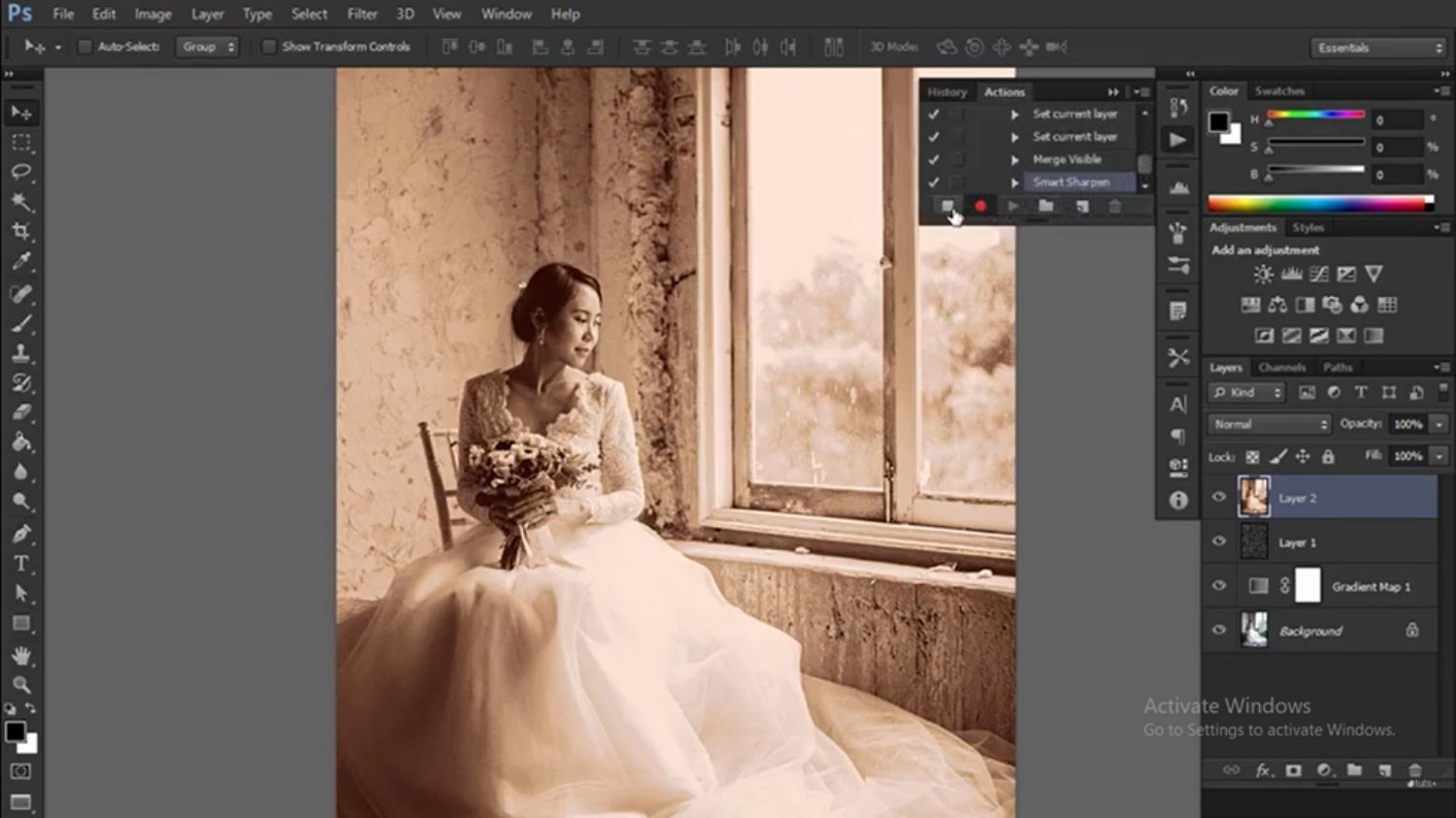
6. Sharpen the photo
- Press filter, followed by sharpen, and then click smart sharpen.

- Go to the smart sharpen tab and move this sliding scale right up so the edges seem brighter.

- Decrease the amount and radius on the smart sharpen panel.

7. End the recording
- To put it in more detail – go to the action panel.

- To keep the sepia color overlay effect, press the stop button to stop the recording.
- To apply the sepia effect created on another photo, the action panel will feature the word ‘sepia effect’ click it and apply it on the photo.

- Choose the photo and pause on it to add sepia tone to it to make it.

- If you want to make changes, mark the action step to pause.

Conclusion
There is absolutely nothing like the sepia toning option that will give the photograph a vintage or nostalgic feel. Thus, you can avoid being exposed to the process of acquiring sepia colors by depending on the darkroom which is harmful for the guide and the environment.
While using both lightroom and photoshop, you are able to achieve better results that personally suits your taste. Use the following easy to follow guidebook in order to effectively add the sepia color to the chosen photos.
Image Credit for Lightroom Tutorial: youtube.com
Image Credit for Photoshop Tutorial: youtube.com


Weekly Picks 15%OFF